
Graphic Design & Branding12 May 20262 min read
How to Build a Strong Visual Identity for Your Brand
A practical guide to the parts of a visual identity that matter, and how to keep them consistent once you start posting.
Also available in Romanian →
A visual identity is more than a logo. It is the set of decisions that makes people recognise you before they read your name. In this guide you'll learn which decisions come first, how to turn them into a system, and how to protect that system once content starts flowing.
Start with a position, not a palette
Before choosing colours, write one sentence about what the brand stands for and who it is talking to. Every later decision should be checked against it. A brand for confident, playful customers will need different shapes and words than one built on calm expertise.
Inklabs is a good example: its whole identity hangs on one idea: tattoos don't have to be forever. That idea gives permission to be loud, direct and a bit cheeky.
The core elements of an identity
Colour
Fewer colours are easier to recognise. Pick one dominant colour, one supporting colour and a neutral. Use the dominant colour often enough that people start to associate it with you.
Typography
Choose a headline typeface with character and a text typeface that is easy to read on a phone. Two families are usually enough.
Imagery
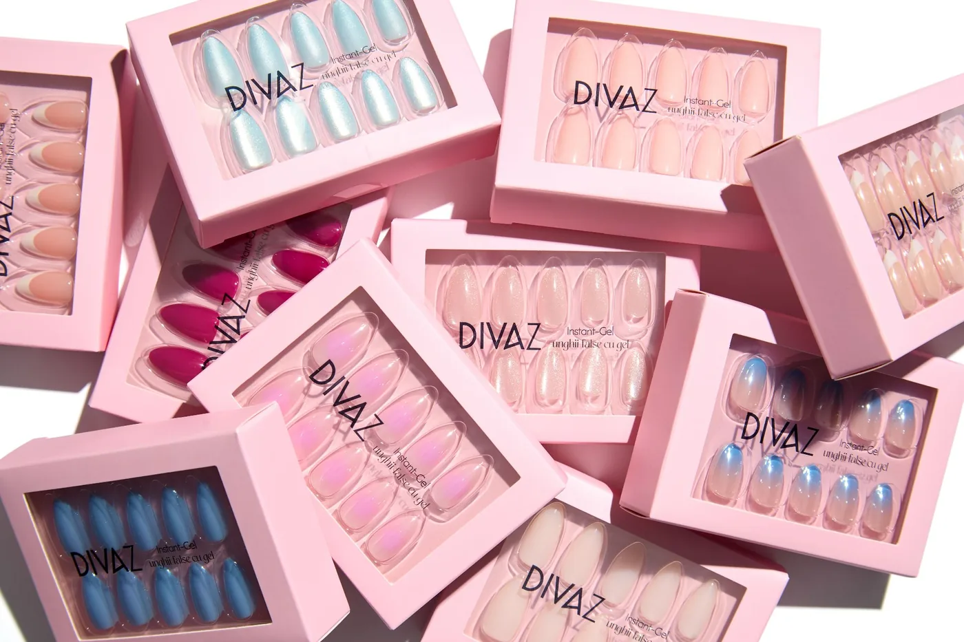
Decide how photos should look: lighting, backgrounds, crop, how people appear. Consistent imagery does as much for recognition as a logo.
Graphic devices
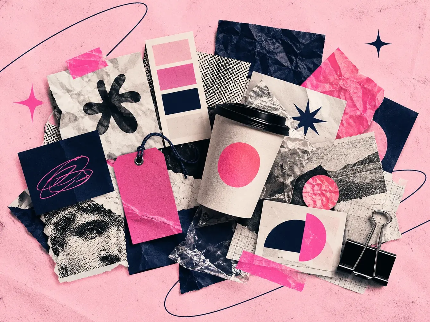
Recurring shapes, frames, stickers or packaging shots give you something to build every layout around.
Turn decisions into a system
A system means anyone can make a new post and it still looks like the brand. Write the rules down and build a few templates:
- Two or three layout grids for posts and stories
- Rules for headline length and size
- Where the logo goes, and where it never goes
- Examples of right and wrong use
Keep it consistent as you grow
The biggest threat to an identity is not a bad design; it is a hundred slightly different ones. Review your feed every month, retire layouts that drift, and update the system instead of making exceptions.
If you'd like help building an identity that lives well on social media, see my branding service.

Keep reading
Work with me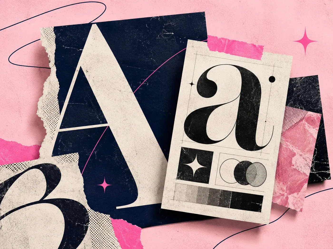
Graphic Design & Branding2 June 20261 min read
Why Some Fonts Make a Brand Look More Expensive
Graphic Design & Branding14 July 20261 min read
7 Branding Mistakes That Make a Business Look Unprofessional
Graphic Design & Branding20 October 20265 min read