Graphic Design & Branding2 June 20261 min read
Why Some Fonts Make a Brand Look More Expensive
Contrast, spacing and restraint: the typographic details that make a brand feel premium, and the ones that cheapen it.
Also available in Romanian →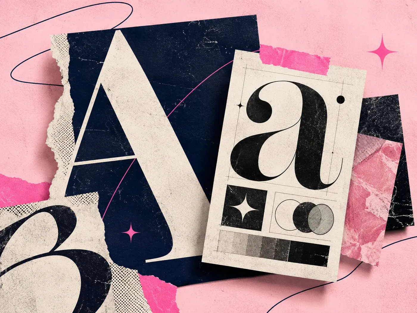
People judge the price of a product by its typography long before they see a price tag. This article explains which typographic qualities read as premium, why, and how to apply them without making your brand feel cold.
Contrast signals craft
High-contrast serifs, with thick and thin strokes side by side, come from a long tradition of fashion and editorial printing. Our eyes link them to magazines, luxury packaging and care.
You don't need a serif to look premium, but you do need contrast somewhere: between sizes, weights, or between type and empty space.
Space is the real luxury
Generous letter spacing on small uppercase labels, large margins and fewer words per layout all say: we don't need to shout. Crowded layouts feel like discount flyers, whatever font they use.
Restraint beats decoration
- Use one or two families, not five
- Limit weights: regular and one bold is often enough
- Avoid effects like outlines, heavy shadows and gradients on text
- Keep headlines short
When premium isn't the goal
Not every brand should look expensive. A playful, accessible brand may lose its warmth with a thin, distant serif. Choose type for the feeling you want, then apply the same principles of contrast and space.
Keep reading
Work with me
Graphic Design & Branding12 May 20262 min read
How to Build a Strong Visual Identity for Your Brand

Graphic Design & Branding14 July 20261 min read
7 Branding Mistakes That Make a Business Look Unprofessional
Graphic Design & Branding20 October 20265 min read